Rabu, 04 September 2019

Asus ROG Strix XG438Q Review: A Massive 4K 120Hz Gaming Monitor - TechSpot

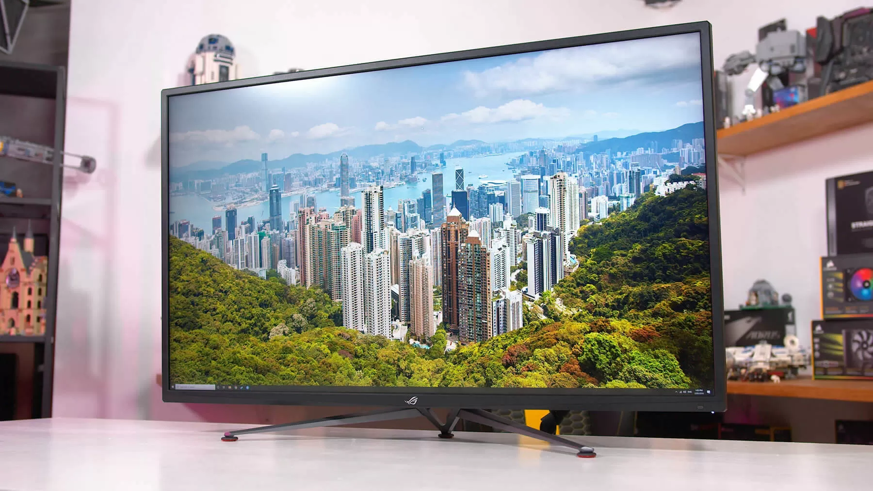
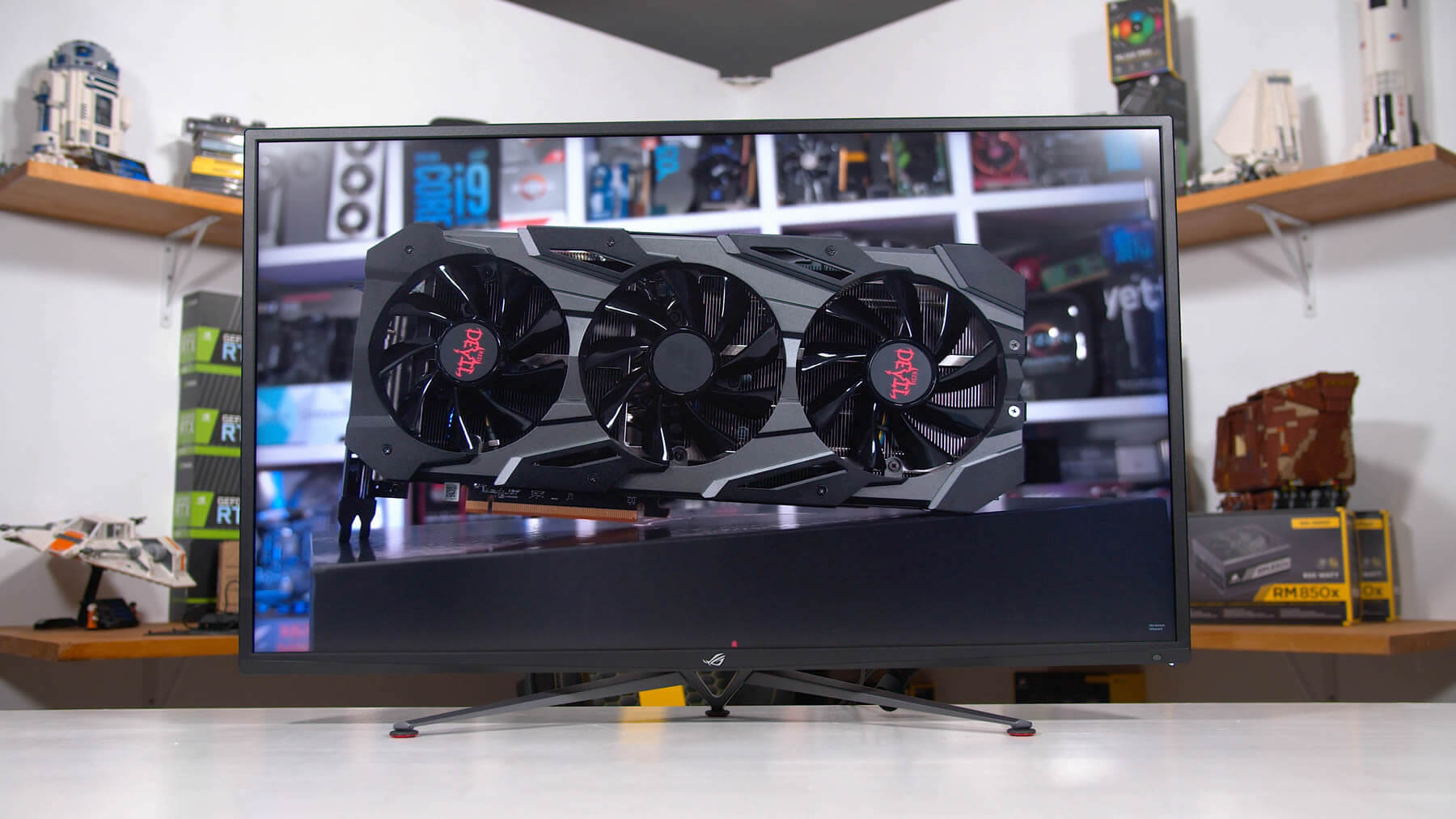
Today we’re checking out the latest large format gaming monitor from Asus, the ROG Strix XG438Q. We’ve seen 43-inch 4K monitors in the past, some of which have been designed for gaming, in fact you might remember our review of the monstrous Philips Momentum 43 last year. But the XG438Q brings several cool technologies together in a single (huge) package.

We’re getting a 43-inch 4K panel at 120 Hz. We’re getting VA technology combined with DisplayHDR 600 certification and FreeSync 2 HDR support, so HDR is a feature here. And we’re getting 90% DCI-P3 coverage for the wide gamut fans out there. All in all, a very decent feature set.

Now, this isn’t the sort of display I’d personally choose to use. I think 43-inches is a tad too big for a monitor at a typical desk distance. But I can understand why others might like it. The display is so big it dominates your field of view, which is great for gaming. For reference, it’s about 20% wider than a 34-inch ultrawide, while also being significantly taller. It’s a similar pixel density to a 27-inch 1440p monitor, so upping the size to 43-inches at 4K gives you heaps more screen real estate to work with, which could be great for, say, a 4x grid of 1080p inputs using the picture-in-picture mode.

You’d definitely want to be a big screen fan though, because this thing will dominate your desk space at nearly a meter wide. For gaming, we think it would be even better if the monitor was curved so that the expansive edges were just brought into your field of view a bit better, but regardless, when you sit in front of this thing you won’t really see anything else.

Design wise, the front is (surprise) all screen. The bezels aren’t particularly small when you put it up against a modern 27-inch monitor, but because the screen is so massive it doesn’t seem like a issue. The wide-prong metal legs support the monitor well, though naturally given the size there’s only tilt adjustability plus VESA mounting support. I couldn’t imagine how difficult it would be to integrate height adjustability into a monitor that weighs 33 pounds.

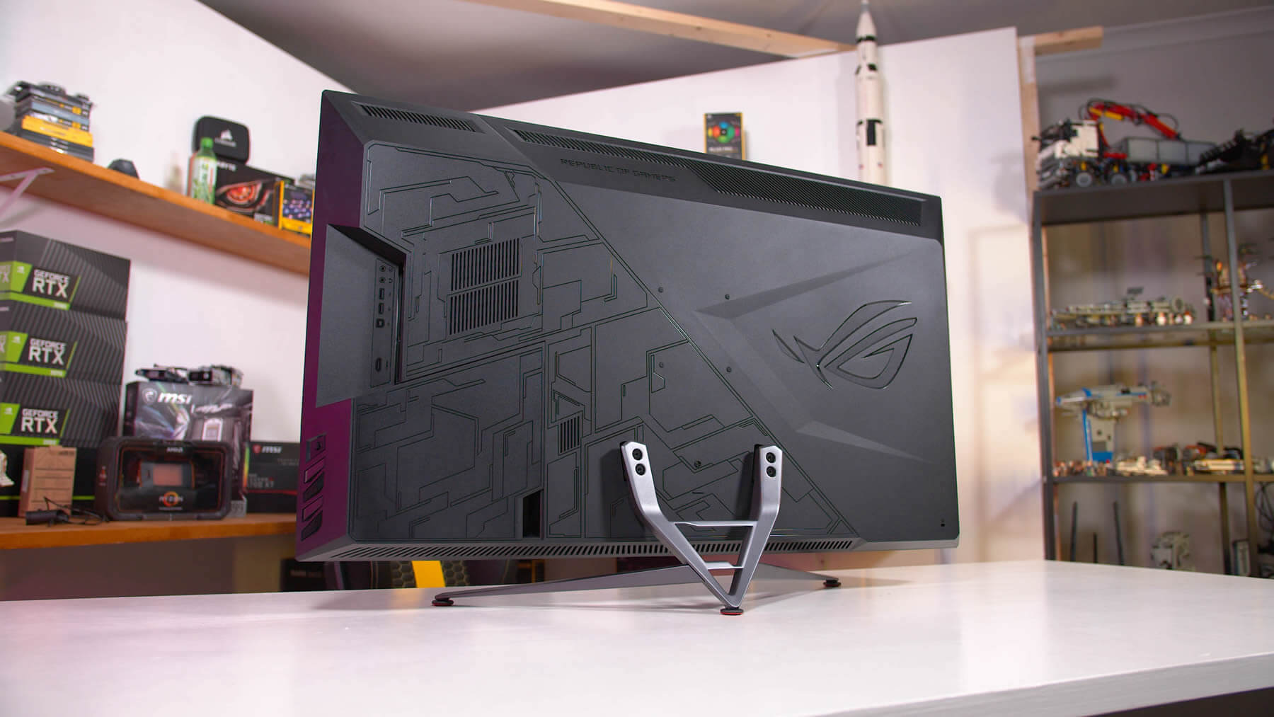
From the back, this thing looks like a TV. There’s a massive Asus ROG logo, a few vents and patterns that typically accompany an ROG monitor design. Surprisingly, there’s no RGB elements into the monitor itself, though you do get this RGB Aura Sync ROG logo projector accessory that you can mount to the back if you want.

The ROG Strix XG438Q comes with four display inputs, there are three HDMI 2.0 ports and a single DisplayPort 1.4. If you want to use the monitor at its maximum 120Hz refresh at 4K, you’ll need to use DisplayPort, as HDMI only supports up to 60 Hz.

And as we’re at the limits of DisplayPort without display stream compression, there are some minor compromises to hit 120 Hz in some situations. You’ll get full 8-bit support right up to 120 Hz, so no issues here for SDR content, however if you want to use 10-bit HDR, you’ll be limited to 60 Hz. 10-bit at either 100 or 120 Hz requires chroma subsampling. However there is nothing stopping you from using HDR in conjunction with 8-bit color depth, and in previous testing we’ve found it very hard to spot the difference between 8-bit and 10-bit HDR on these sorts of panels, given this is a native 8-bit panel anyway.

For other I/O we have some audio jacks and a USB 3.0 hub. The built in speakers are decent for a monitor, much better than average if this is something that matters to you.

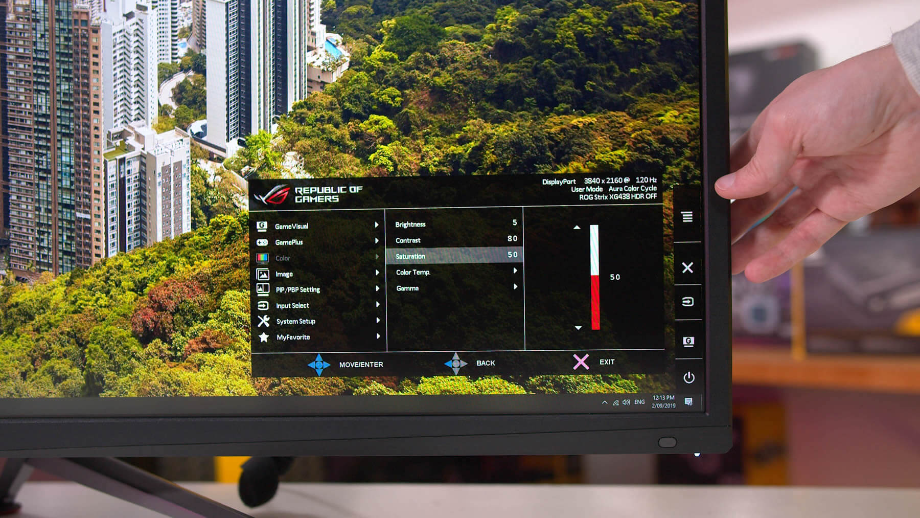
The on screen display can be controlled one of three ways: the directional toggle on the rear, the included remote control, or via Asus’ software utility. You’ll find all the usual stuff like cheat crosshairs, shadow boosting modes, timers, and so on. One of the big omissions is perhaps a backlight strobing mode, which Asus usually calls ELMB, though typically this is for higher refresh displays at 144Hz or above.

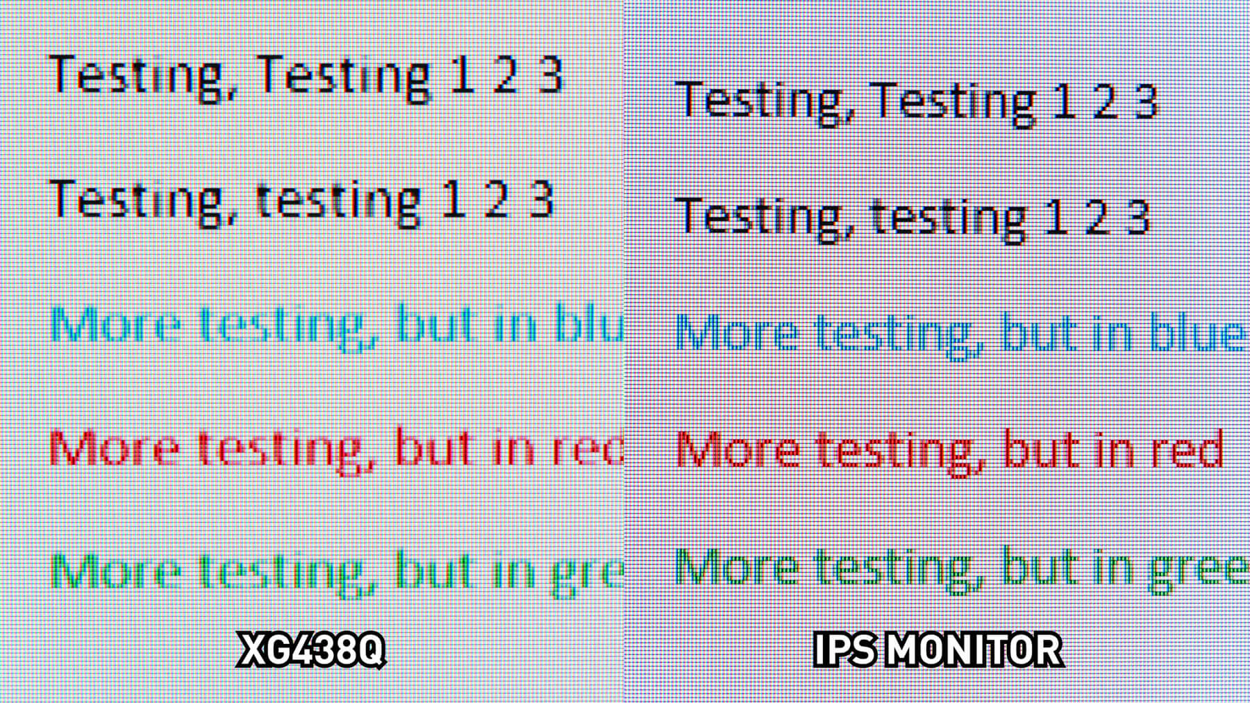
Before getting into some other aspects of performance, we wanted to talk about how this monitor handles fine detail. It’s a 4K display that’s large enough to use at its native resolution without scaling at a standard desk distance, so it should handle text and other fine detail well. Unfortunately, it doesn’t, and that’s down to its subpixel layout.

Here are two side by side images that show how the XG438Q handles text, next to an IPS monitor of similar pixel density. The XG438Q is running in its SDR mode at 4K 120Hz over DisplayPort, although because this is an issue with the panel itself, it doesn’t matter what configuration you are in. You can clearly see from these images that text is sharper and clearer on the IPS monitor compared to the XG438Q.

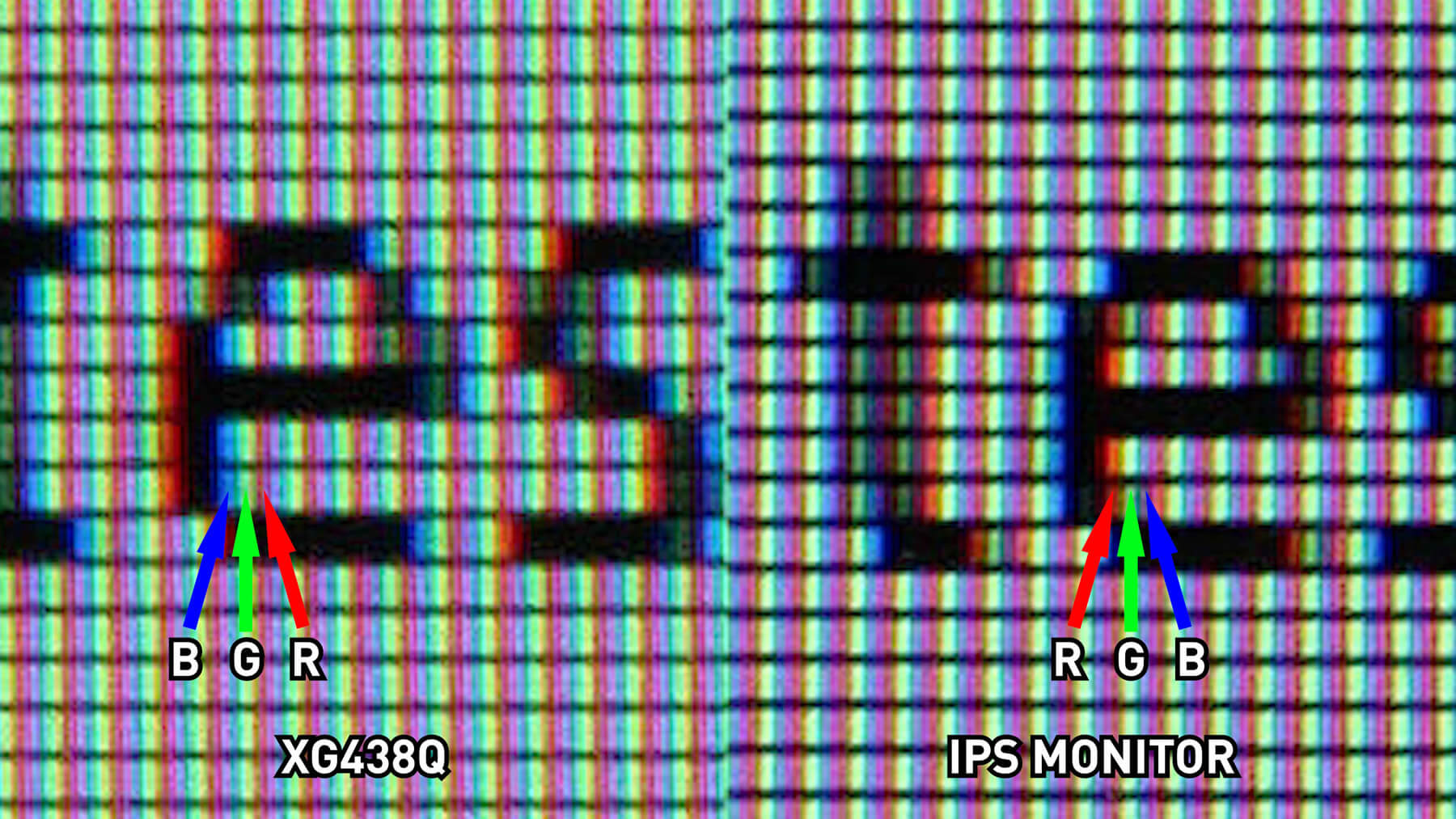
If we zoom in more, we can see why this is the case. The IPS monitor uses a standard RGB subpixel layout, which is what your operating system expects and plans for when rendering text. The Asus XG438Q uses a rarer BGR layout, which even modern operating systems don’t really know how to handle well. Using ClearType in Windows can help mitigate the issue somewhat, and we ran the utility for the images you’re seeing here, but it can never be resolved fully so what you’re left with is slightly blurry and odd looking text. Had Asus rotated the panel 180-degrees to make it RGB, this wouldn’t have been an issue.

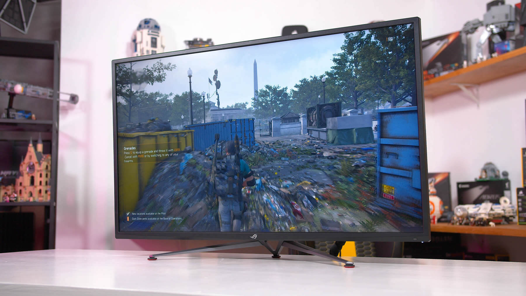
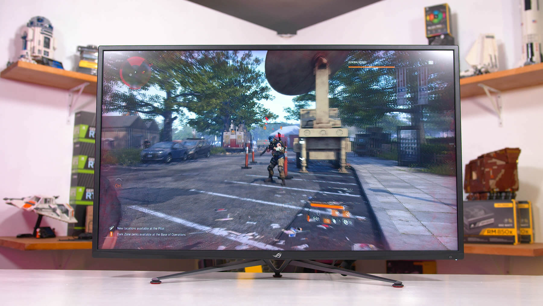
How much of an issue is this in practice? For gaming, it’s not a big deal at all. It’s also not as much of an issue with larger fonts, so using a 150% scale or higher tends to hide the problem. But if you were planning on using this as a productivity monitor at its native resolution scale, the BGR layout could annoy you.

Performance

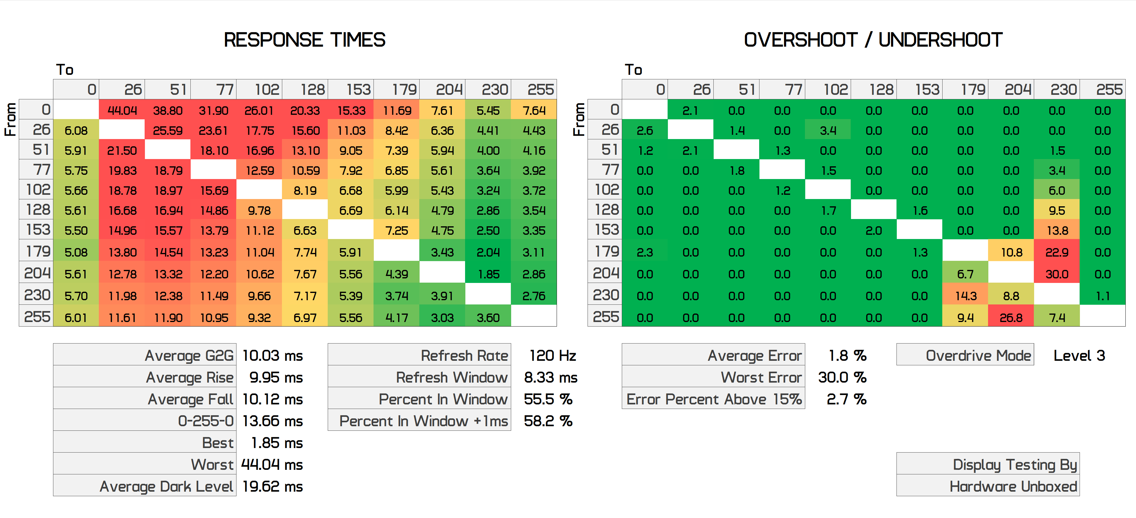
Moving on to other aspects of the monitor, starting with response times. This is a VA panel so we're not expecting miracles. Using the default overdrive mode, Level 3, we get severe dark level smearing. An average of 19.62ms for dark transitions is not great, and neither is the overall grey to grey average of 10.03ms. However, overshoot is well managed in this mode, so let’s push things up a bit.
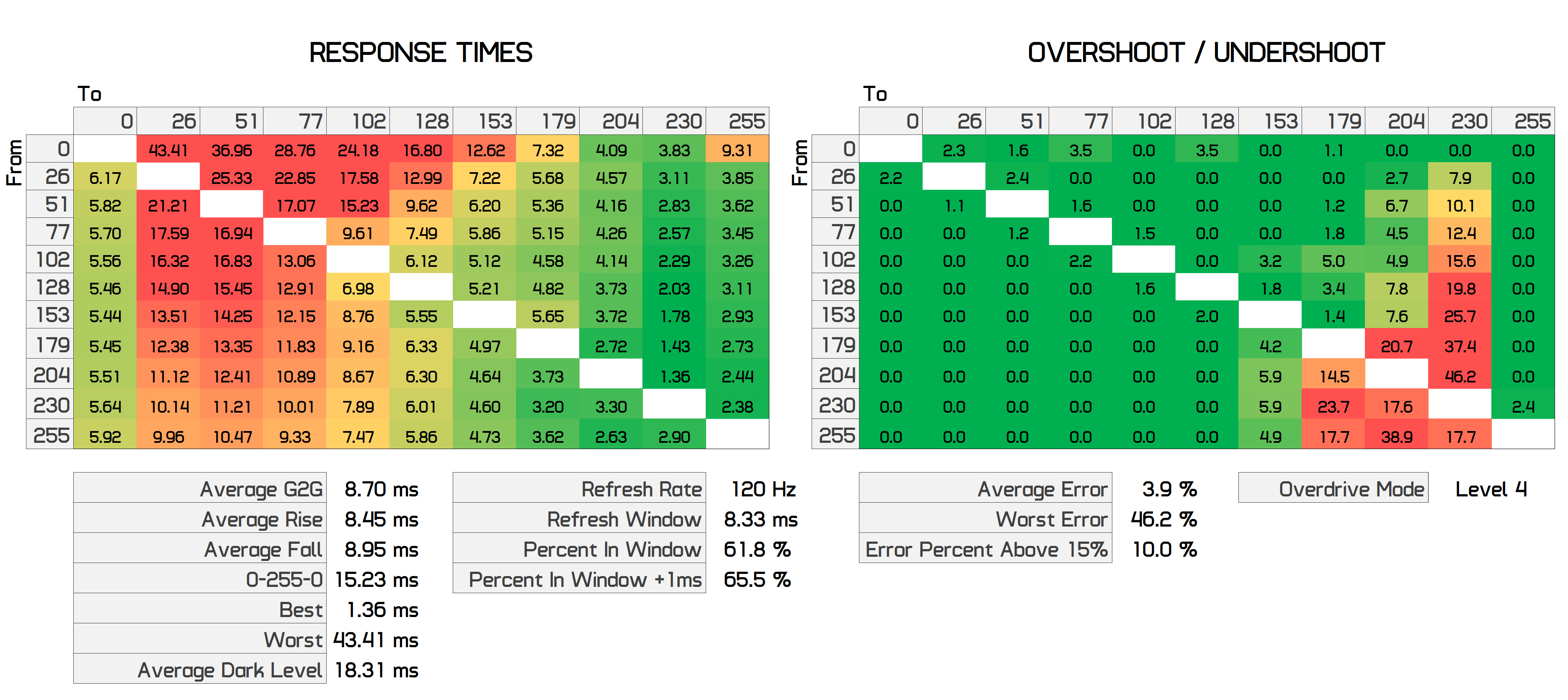
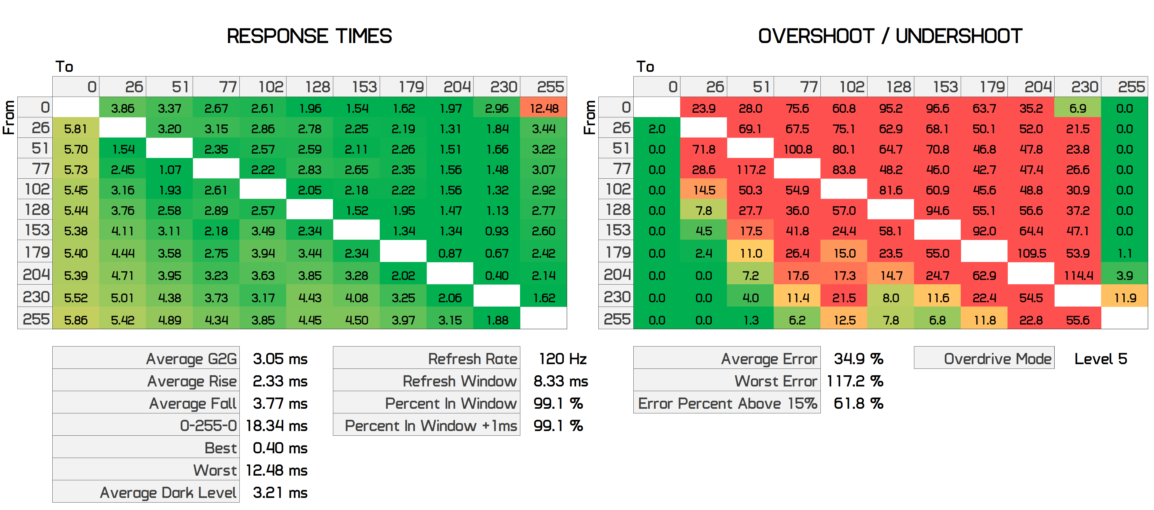
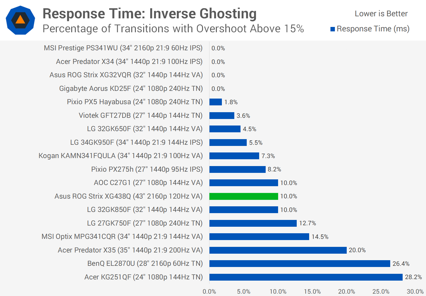
Level 4 does improve the overall average to 8.7ms and the error rate is still manageable, with just 10% of transitions having more than 15% overshoot. However dark level smearing is still a big issue here. We can go all the way up to Level 5 which significantly improves response performance, but that comes at the expense of an average error rate of 35%, which is massive. I wouldn’t recommend using this mode unless you love inverse ghosting. There are also levels below 3 that you can use, but each step is even slower so we won’t bother covering them here.
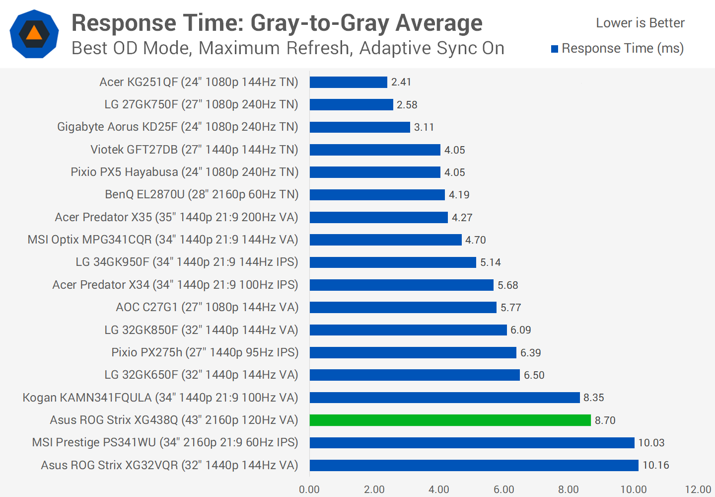
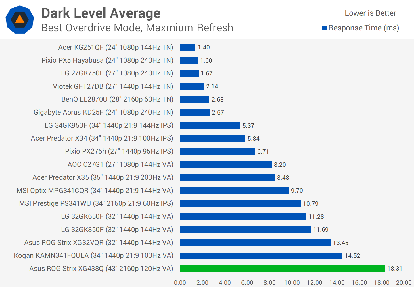
Using the optimal level 4 overdrive mode at 120Hz and comparing to other displays, we’d say the XG438Q is slow in general. The best VA panels we’ve tested can be seen with an average in the 4.5 to 6.5 ms range, so 8.70ms is on the worse end of the scale.
And that’s exacerbated by an 18.31ms dark level response average, which is the slowest result we’ve recorded, indicating this monitor has the worst dark level smearing of the seven VA panels we’ve tested. A 10ms average isn’t amazing from some of the better monitors, so at 18ms you’ll be noticing it.
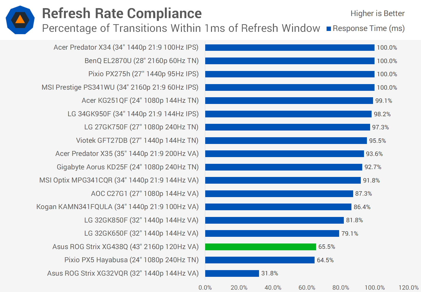
Refresh rate compliance is also mediocre, with just 65% of all transitions getting close to the 8.33ms window required for true 120Hz. It’s the dark level performance that lets this display down, as brighter transitions are much faster and easily fall within 120Hz. And with this optimal overdrive mode, the error rate is pretty standard so inverse ghosting isn’t a huge issue.
For those wanting to use this display at 60Hz, you should use the level 3 overdrive mode, which performs very similarly to level 4 at 120Hz. An 8.8ms average here is okay, but again a dark level average of 15.91ms is an issue.

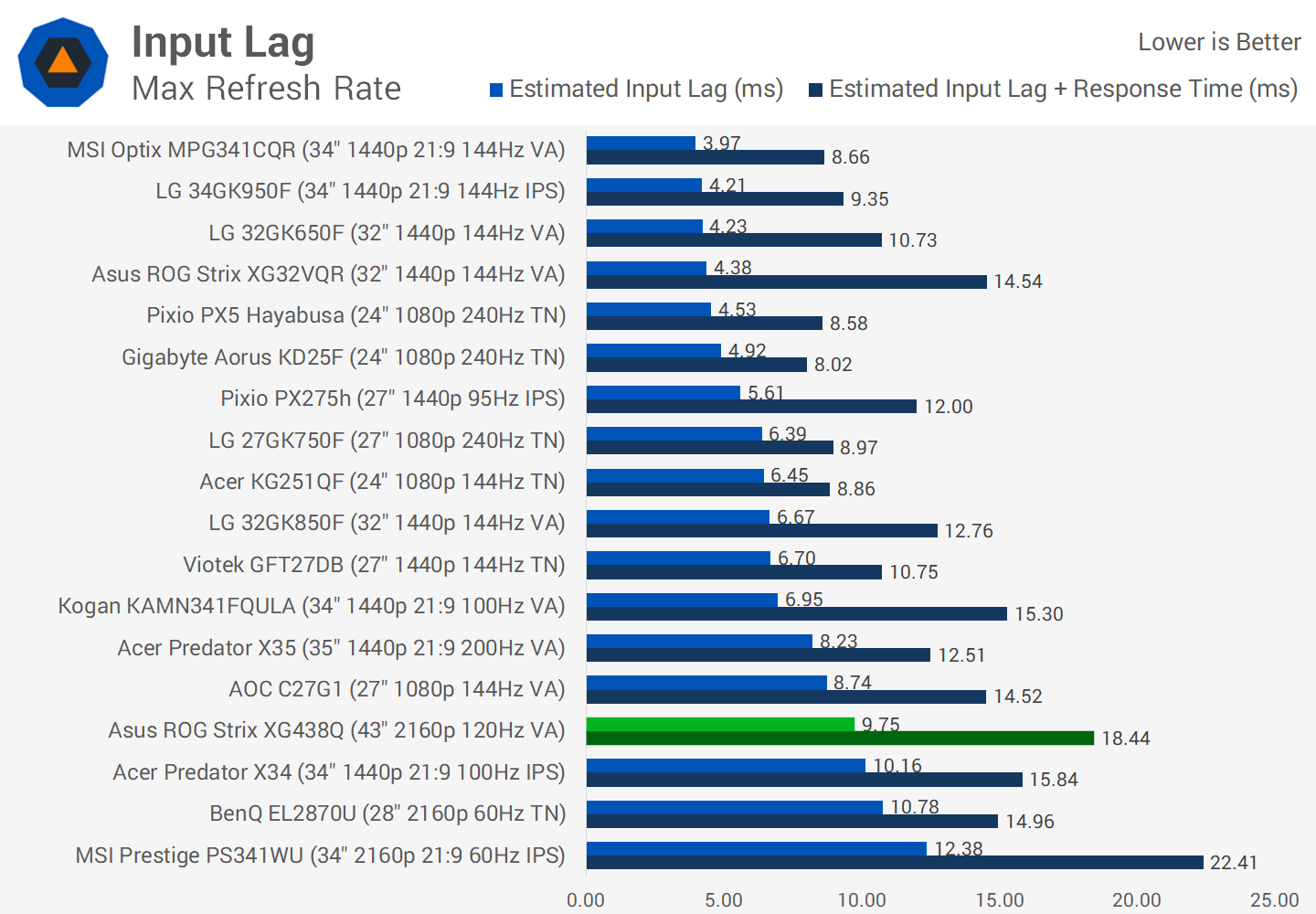
Input lag again is not amazing, a result of 9.75ms in our testing indicates that there’s around 4.5ms of processing lag. Not terrible, not amazing. For a 120Hz monitor we’d perhaps like a little faster input lag but then again it’s around the same mark as the Acer Predator X34.
As for color performance, couple of quick notes before we get into it. The XG438Q supports 90% DCI-P3 coverage, but there’s no sRGB toggle, so out of the box colors are oversaturated. The local dimming backlight is also enabled by default, which does affect performance. Also, due to its low zone count – there’s just eight edge lit zones – haloing is very noticeable for desktop usage. Normally I would only enable local dimming for HDR content but it’s enabled by default, so let’s see how it performs.

Default Color Performance

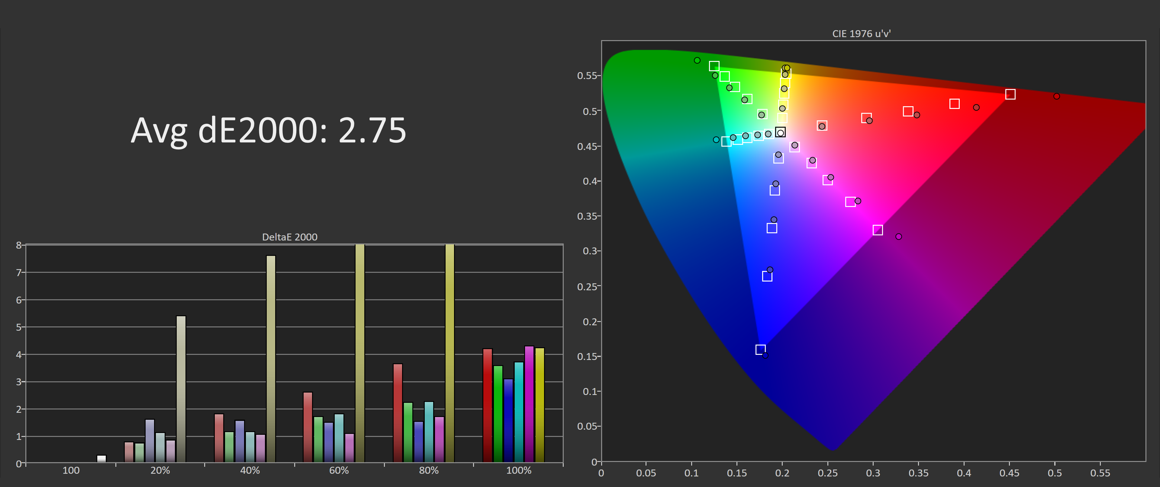
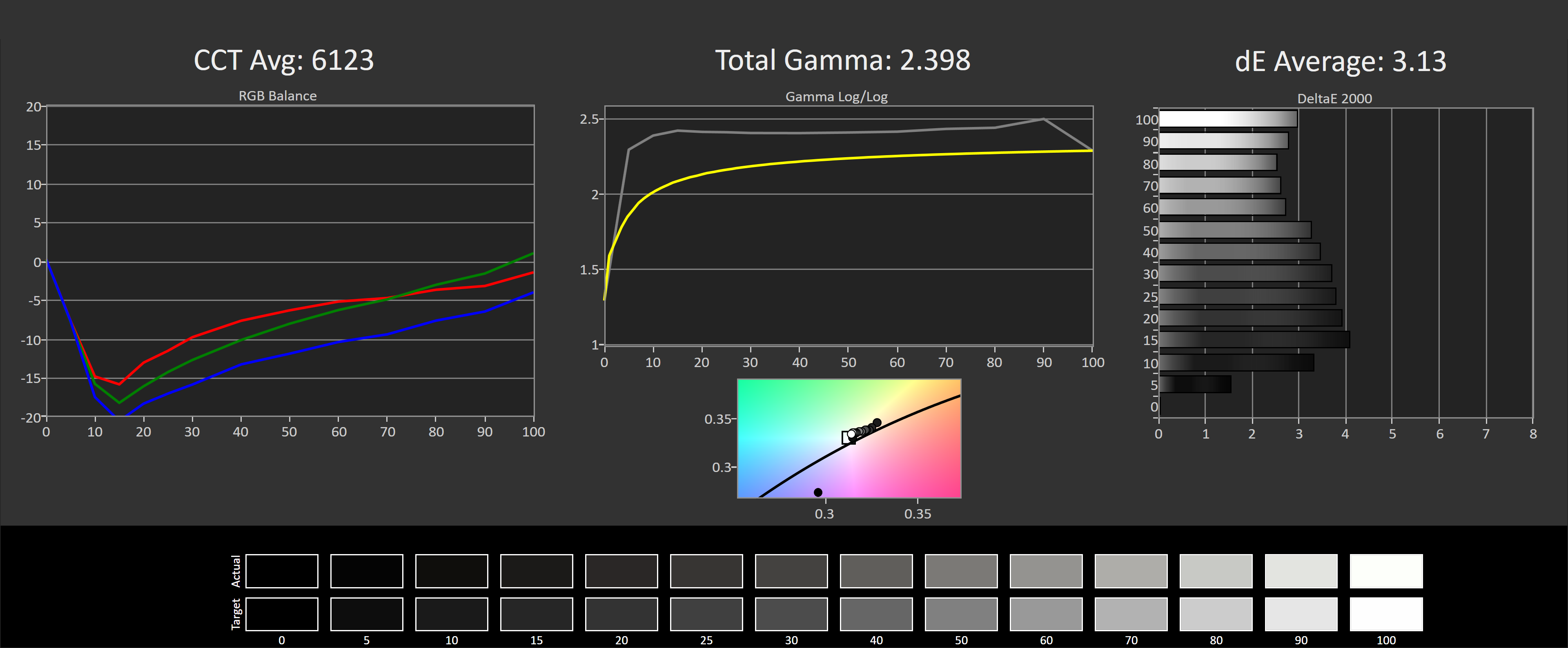
When testing the display against the sRGB standard, things get off to a rocky start in greyscale. While the color tint is okay and a CCT average of 6123K is only slightly warm, the gamma curve of around 2.4 is well off the sRGB standard, and a deltaE average of 3.13 is outside the accurate range we usually like to see, which is below 2.0.
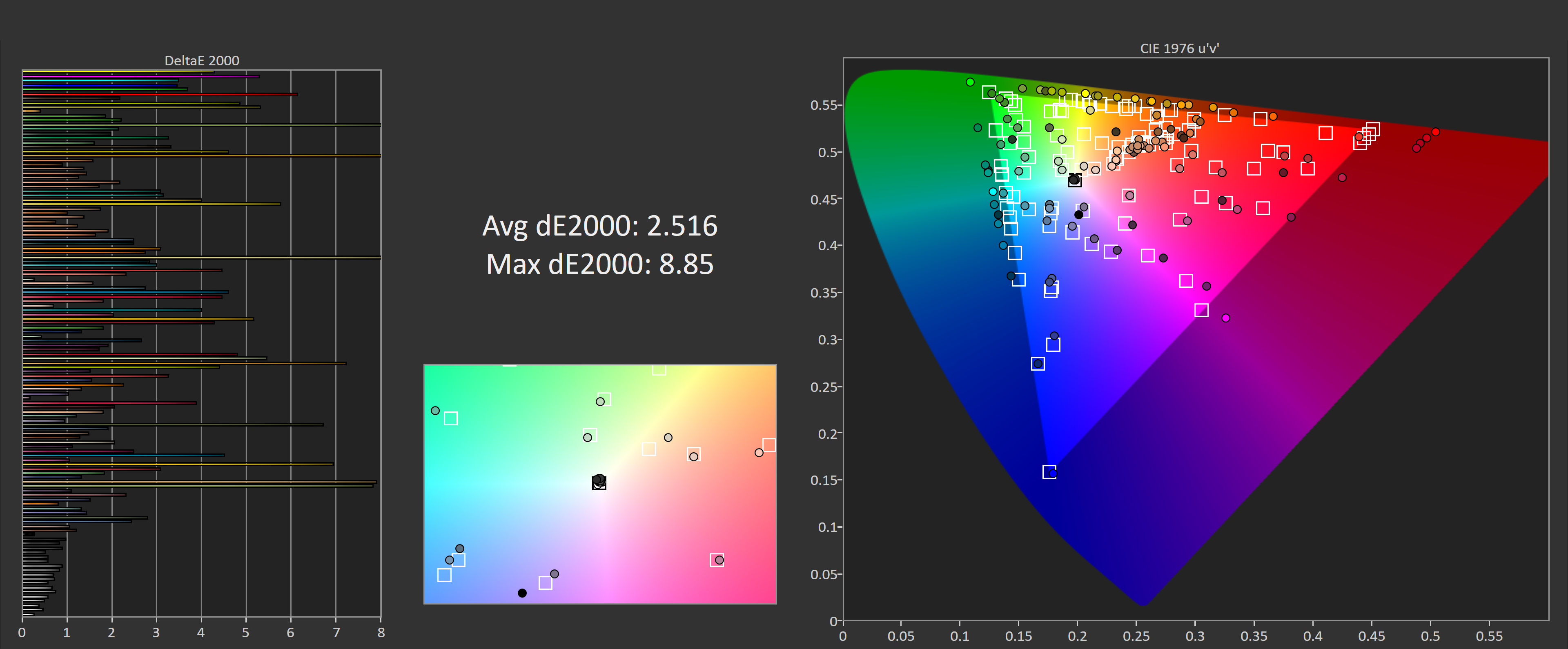
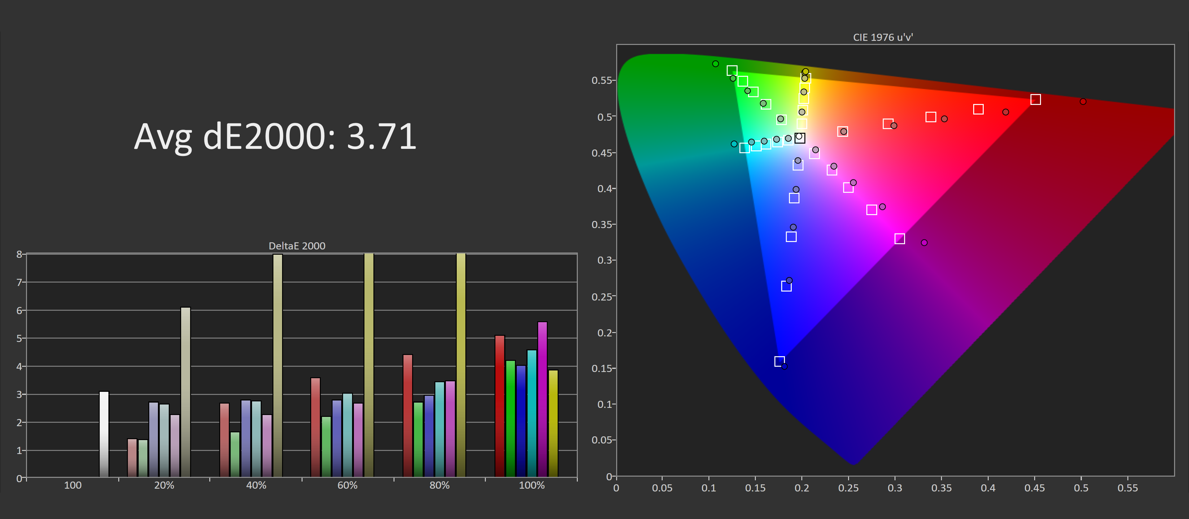
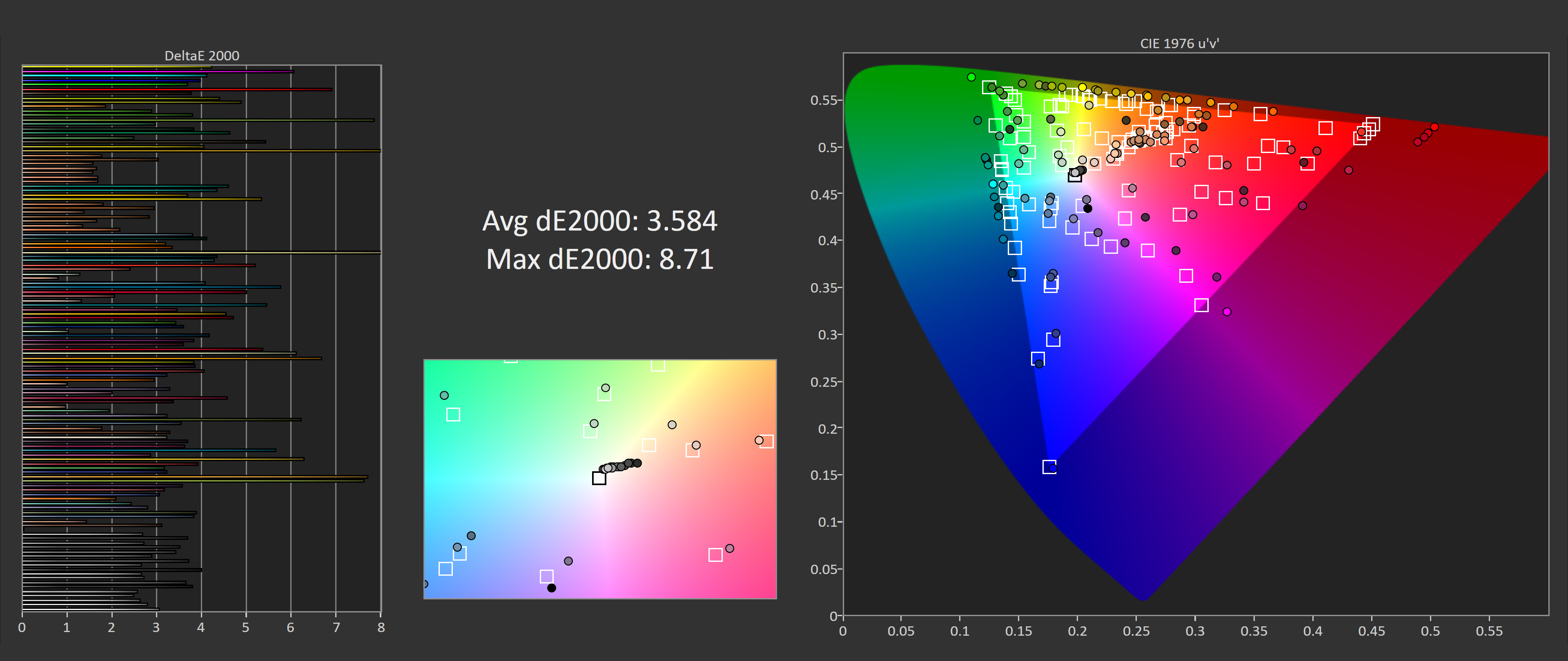
As we get into saturation performance, the most noticeable issue with performance here are yellows: they are miles off and clipped at the top end for some bizarre reason. This leads to an overall deltaE average of 3.71, plus we’re getting oversaturation due to the wide gamut. It’s no surprise to see similar performance with ColorChecker: a deltaE average of 3.584 again isn’t as accurate as I’d like.
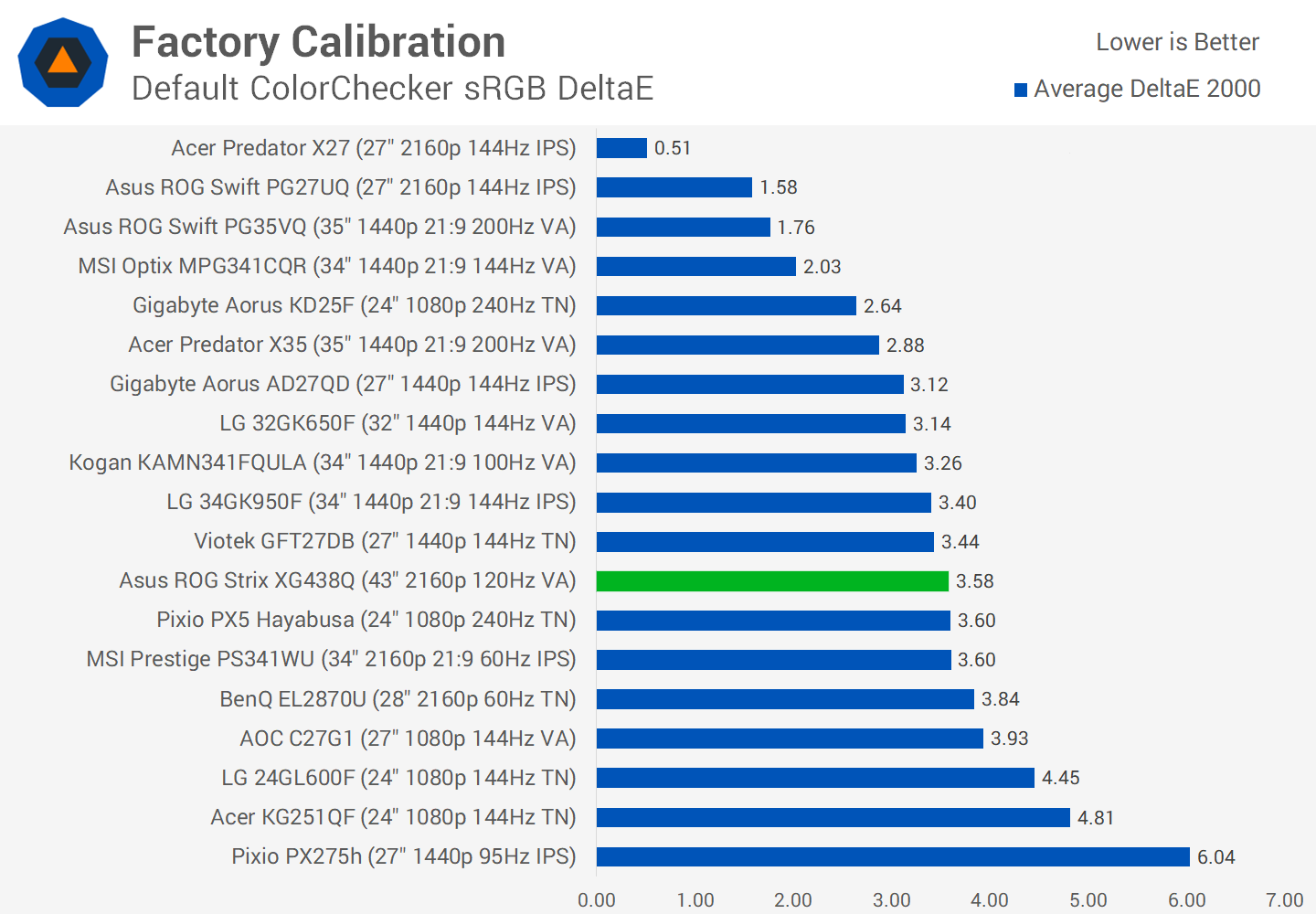
That said, when comparing this monitor to others in their default configuration, it falls in the typical gaming monitor zone where deltaEs are between 3.0 and 4.0.
If you want more accurate performance, the key feature to turn off is the dynamic backlight. This seems to affect the gamma performance, and to me looks pretty crap for use with SDR content or desktop apps. I also made some slight tweaks to color temperature for my unit, and of course switched the overdrive mode to Level 4 as we found earlier.

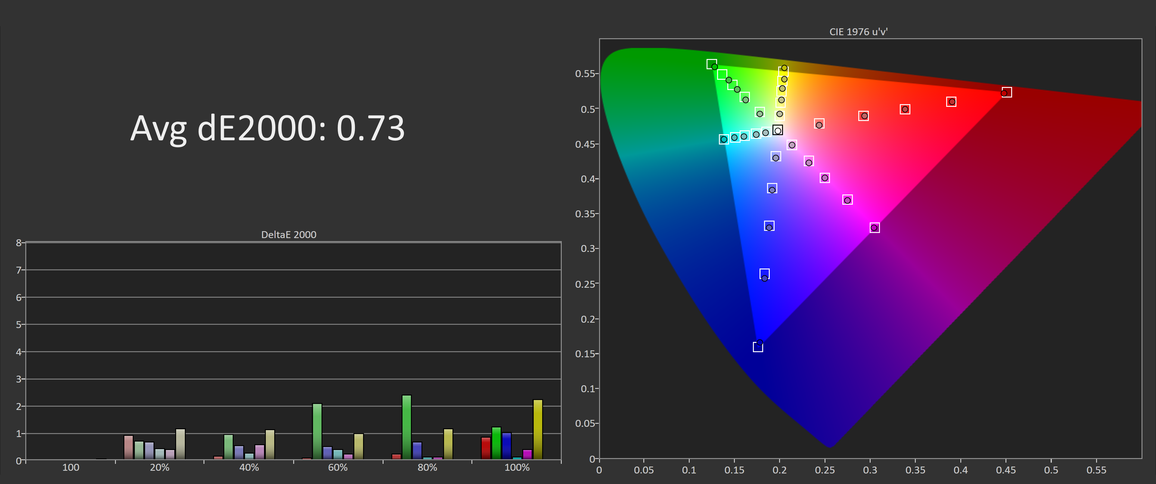
With those changes in place we see pretty significant improvements to greyscale performance. The deltaE average is rock solid, as is the adherence to the sRGB gamma curve. This is a really strong result achieved without a full calibration. Unfortunately, the issue with yellows is not resolved, so color performance in our other tests is still pretty poor.

OSD Tweaked Color Performance
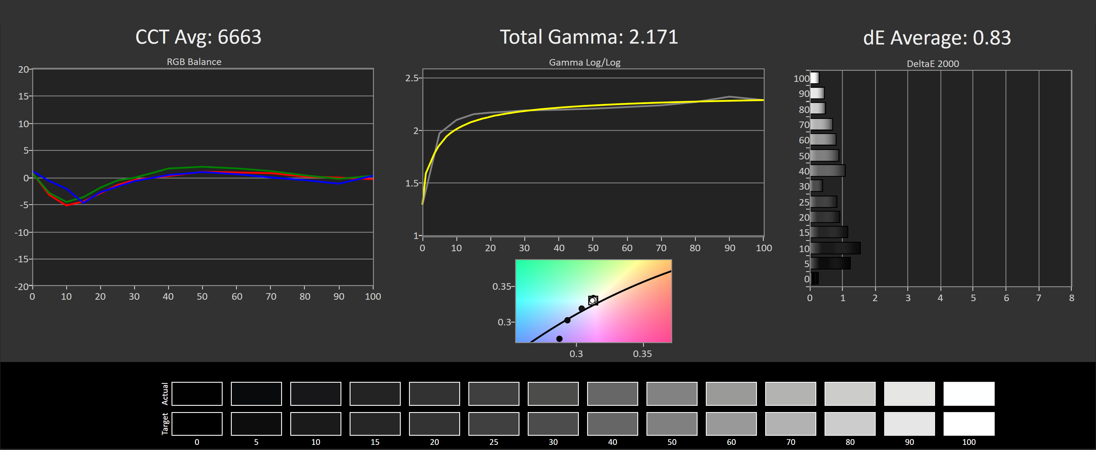
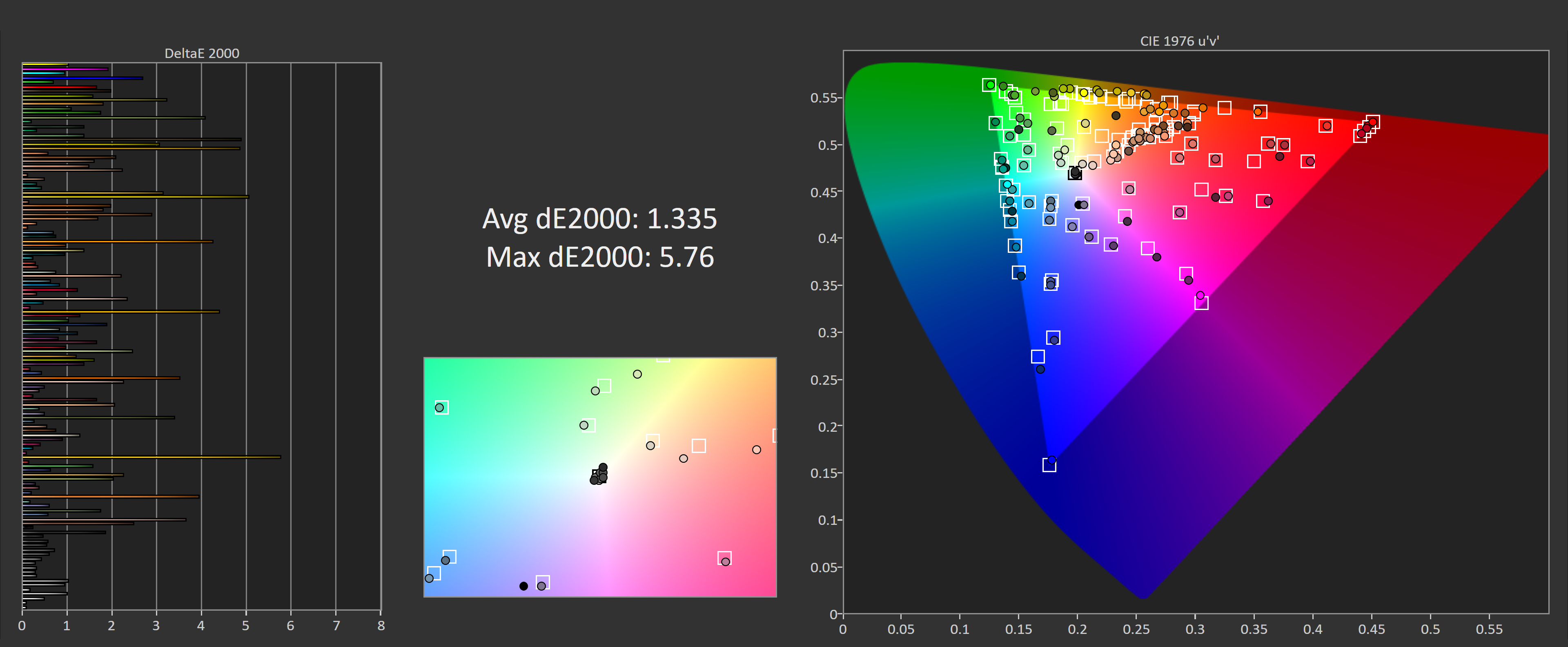
To get things nice and accurate, you do need to perform a full calibration, which fixes issues such as the weird yellow performance and also allows you to get sRGB accurate colors for general usage. It’s not a perfect result as you’ll see here from the ColorChecker test, where ideally there would be no colors tested with a deltaE above 2.0, but for a gaming monitor this is fine.

Calibrated Color Performance
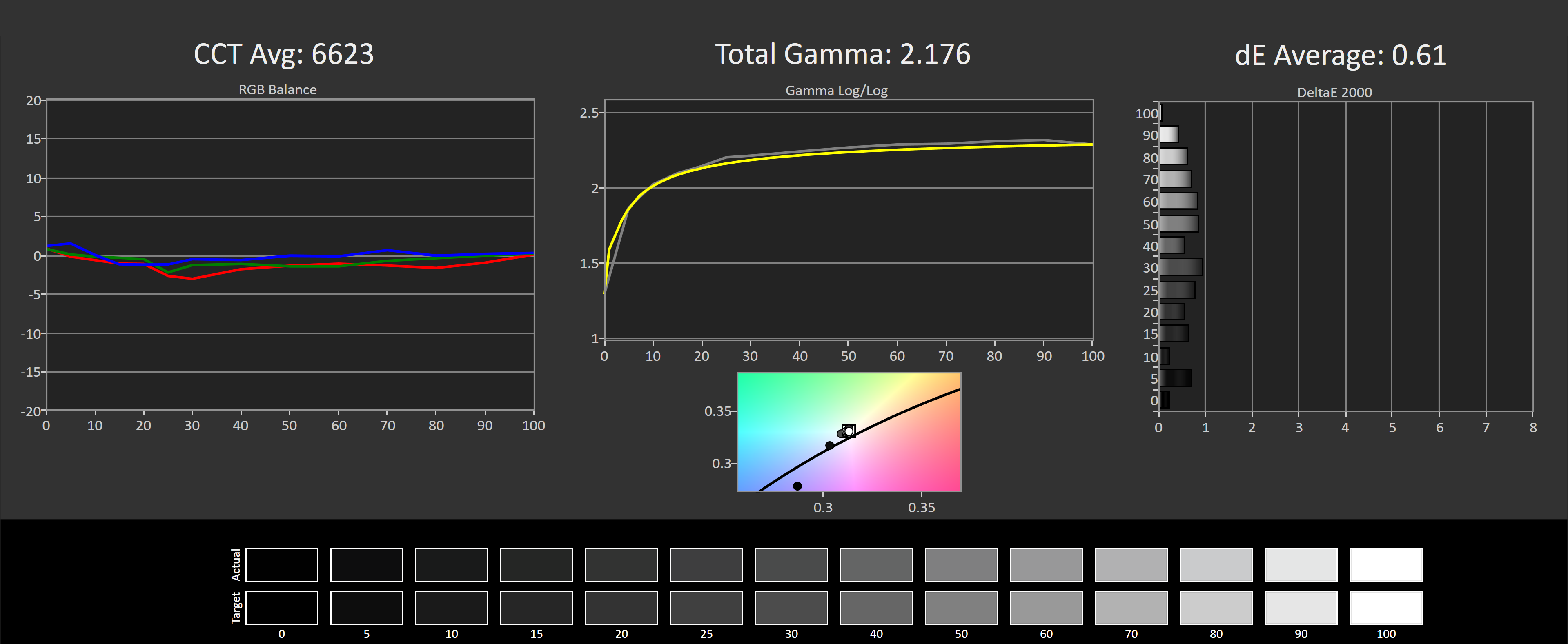
The monitor is also quite accurate when calibrated for D65-P3 performance, there is a small amount of clipping at the top end as gamut coverage is only 90% rather than 100%, but that’s to be expected. If you like a bit of oversaturation and like vivid colors, this will be a great monitor for you.

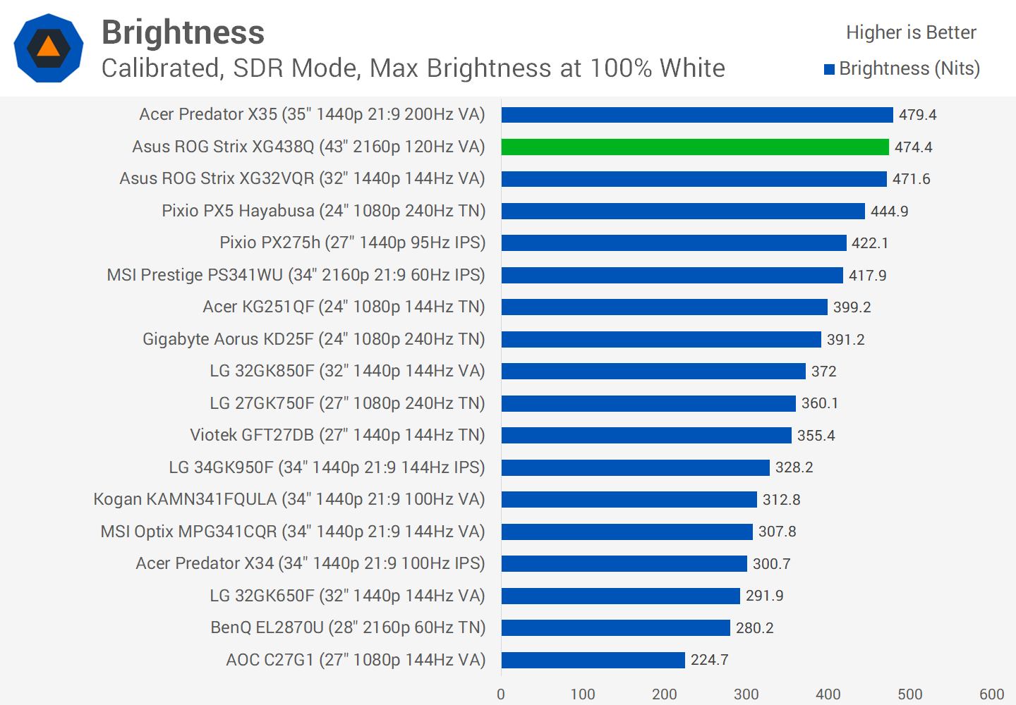
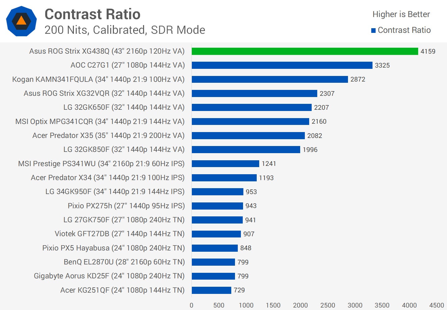
Brightness in the SDR mode is excellent, topping out at 474 nits. The native contrast ratio is also very good, so don’t be shy in disabling that dynamic backlight for SDR usage, as you’ll still get over a 4000:1 contrast ratio after calibration. And calibration in the first place doesn’t have a significant impact on contrast ratio, so we’re not hurting native panel performance further in its quest for deep blacks.
Unfortunately, uniformity is poor. This was the same issue with the Philips Momentum 43: with such a large panel, uniformity issues are hard to prevent and easy to spot. With this monitor, the bottom third of the panel is off compared to the rest, at least for our review unit, and there’s noticeable vignetting as well. It’s not something you’ll notice in gaming, but for web browsing with large areas of the same color, you might find it annoying.

HDR is also a big feature. Asus is touting DisplayHDR 600 compliance which is a little lower than the DisplayHDR 1000 we’ve seen from previous 4K 60Hz monitors of this size, but it’s still promising for those that do want some HDR functionality. What we’re getting here falls into the semi-HDR category. Brightness is good enough, at 600 nits peak and sustained, as is the color performance which hits 90% DCI-P3 coverage without issue. However the lack of a full array local dimming backlight, with Asus instead opting for just 8 edge lit dimming zones, prevents you from getting the full high contrast experience that is expected of true HDR.

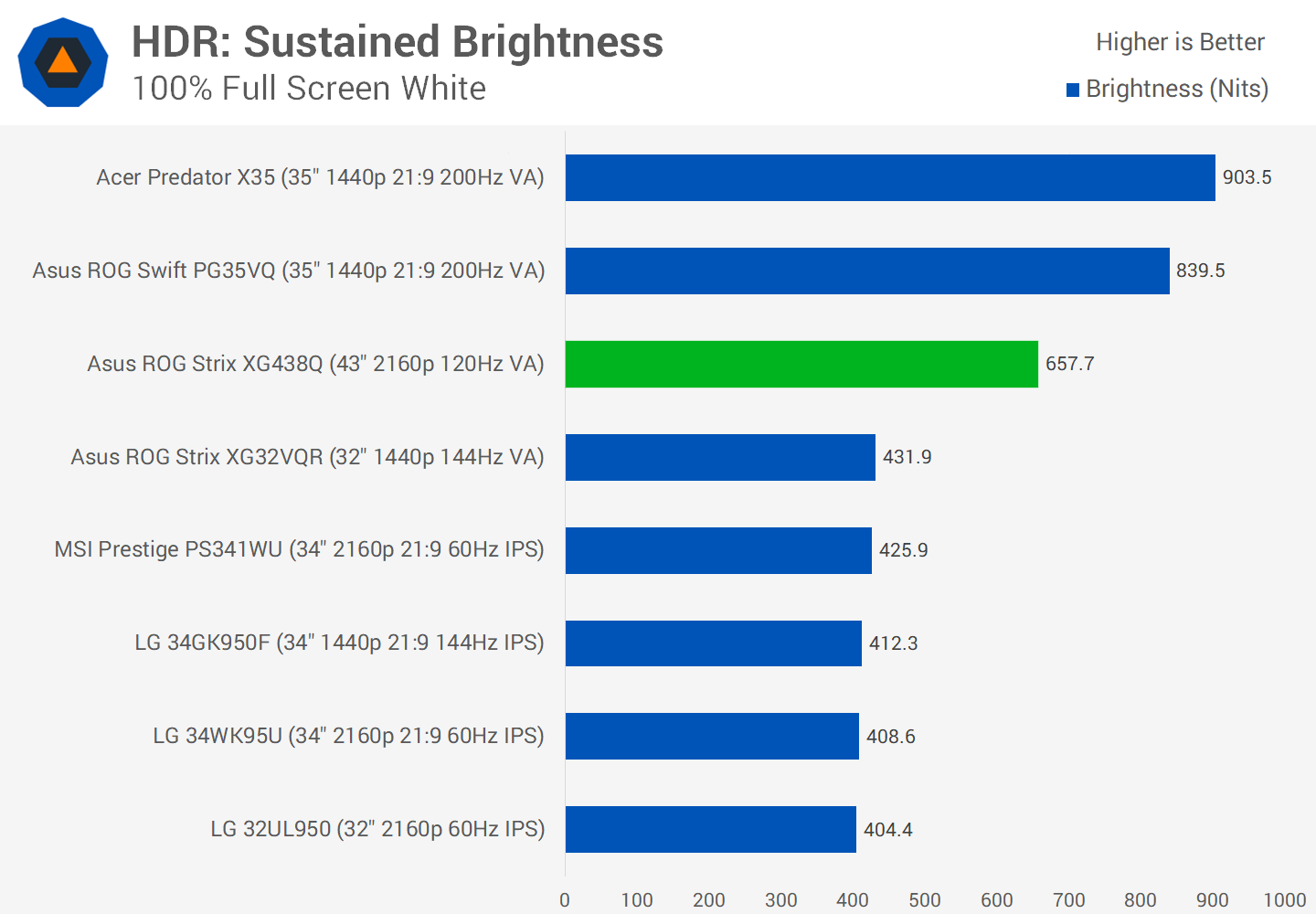
HDR brightness is good, hitting 660 nits whether sustained or flash, and there’s only a small drop off to around 550 nits for small window sizes. While high zone count monitors tend to increase the brightness as the window size decreases, with low zone count monitors it’s the opposite. Luckily the drop is only minor here.
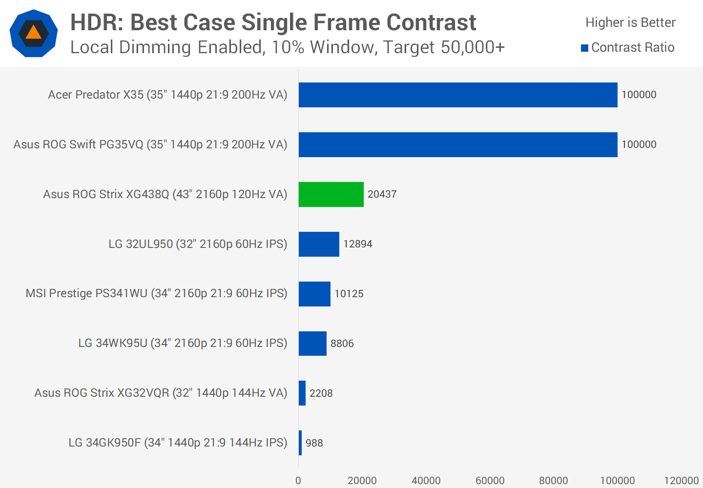
Contrast is very good, with the dynamic backlight almost turning off the backlight when displaying a full black image. This leads to a very high best case contrast ratio. However when looking at single frame contrast, which is the cornerstone of HDR, the edge lit backlight can only manage a best case ratio of 20,000:1, which is below the ideal 50,000:1 or higher. So we are getting a better-than-native contrast ratio, around 5 times higher, but because of the low zone count the monitor can only hit these sorts of ratios in large chunks.
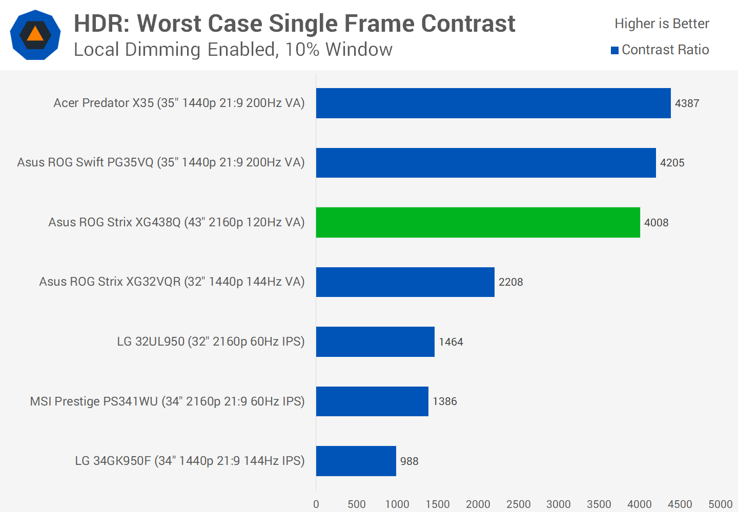
The XG438Q performs well in our worst case HDR contrast test, because of a very high native contrast ratio of 4,000:1. While we’re not getting above native contrast here, it actually outperforms the Asus PG35VQ with its FALD backlight. This is because while the PG35VQ does have much better zone control, it has a lower native contrast ratio, and the FALD backlight is only good for an extra 1500:1 in this test.

Is It Good?

I’m in two minds about the Asus XG438Q. It’s a big monitor, it supports 4K at 120 Hz, and it is decent for HDR in specific scenarios. Most other 43-inch monitors up until this point have only been 60 Hz capable, so the XG438Q is unique in that respect and offers something better for gamers.

However, it’s fair to say there are some performance to be noted. The BGR subpixel layout has been a problem for other 43-inch monitors, and it rears its head again here, which leads to poor text rendering at a 100% resolution scale. Response time performance is below average with particularly poor dark level smearing. And while the monitor does a decent job of greyscale accuracy when you disable the dynamic backlight, there are a few color performance oddities as well, plus weak uniformity.

Normally we wouldn’t recommend this sort of monitor, but it’s also the only option for high refresh gaming at this size. Even though performance is only average, it’s going to be better than 4K 60Hz equivalents for gaming simply because it has a higher refresh rate, provided you can utilize it. If you don’t have a powerful enough GPU, or gaming isn’t a use case for you, go for a 43-inch 60Hz IPS monitor instead.

The ROG Strix XG438Q is brand new and its pricing has yet to be set in stone. We estimate it will set you back around €1,200 in Europe and $1,100 in the US. In other words, you will pay a premium for the 120 Hz support. Paying double isn’t unusual to get high refresh rates, but ideally a $1,000 monitor should perform better in most respects, something the XG438Q doesn't quite achieve. With that said, this isn’t the first time we’ve run into issues with a 43-inch 4K VA panel, so we won't place the blame on Asus. Instead it seems to be as good as you can get for current-gen panels of this size, which clearly aren’t as popular as some of the more refined smaller sizes for the time being.

Shopping Shortcuts:

Let's block ads! (Why?)


https://www.techspot.com/review/1905-asus-rog-strix-xg438q/

2019-09-04 11:03:00Z
52780373084863
Google can’t fix the Android update problem - The Verge

Android 10 is official and as of this writing it’s only available on a very small number of phones: Pixels and a few others. I’ll have a review up later today, but here’s a quick preview: it’s good, does a better job of protecting your privacy, but none of that matters if you can’t get a phone that runs it.

It’s difficult to maintain a sense of outrage over Android’s atrocious track record of providing upgrades to users year after year. We’re at the tenth version, after all, and the story on upgrades is the same today as it was a decade ago: first-party Google devices get updated quickly, everything else takes months or doesn’t get updated at all.

It’s not entirely fair to say nothing’s changed, though. Google has strong-armed manufacturers and carriers into letting it push critical security patches out more quickly. And starting with Android 10, a new initiative called “Project Mainline” will mean some of the plumbing inside Android can be updated directly via the Play Store.

That’s all important, but it’s not what people want. They want the big updates. Yet the Android ecosystem seems designed to keep major OS updates from getting prepped and delivered to users. That’s because it is. And since this situation hasn’t changed in a decade, there’s an incontrovertible conclusion to draw:

Google can’t fix it. No one can.

The state of Android updates is still dire

Take the recent report from Counterpoint Research, which points out that Nokia is far and away the best manufacturer when it comes to issuing major OS updates (after Google and Essential, both of which have far fewer devices to support). It includes this revealing chart, which plots out the percentage of a company’s “portfolio” adoption of Android 9 Pie in the year since it’s been released.

The thing that jumps out at you in this chart is how far ahead Nokia is! But this is actually a chart about failure. Here, let me highlight the most important quadrants:

Six months after release, only one manufacturer managed to get half of its portfolio updated, and only two managed over a quarter. A full year after release, only three managed to break the 50 percent mark! And the two most important and largest manufacturers — Samsung and Huawei — ended up at around 30 and 40 percent, respectively.

The lion’s share of phones sold during that period were running the latest version, but very few existing phones were upgraded to 9. There’s a more traditional metric for measuring the install base of Android we can look at, too, and the numbers are equally bleak. That would be Android’s own distribution chart:

Android Distribution, May 2019

As of May, Android 9 Pie had just barely managed to crack 10 percent. That’s much better than in years past, but still awful.

Google can’t fix it

This is all a result of how the Android ecosystem works.

There’s an open-source group, Android, that nominally is separate from Google and has all the major players participating in it. They’re all free to take the core of Android and do with it what they will (within reason). Some of them apply minor customizations that are easy to move from version to version, some do stuff that’s much harder. Sometimes (often), there is diminishing value for a manufacturer to go through all that effort, especially on older phones. And on top of all that, carriers usually want to verify all those updates won’t mess with their networks, slowing the process down further.

That’s the simple version of why Android updates take forever. The slightly more complicated version is that when I wrote that Android is “nominally” separate from Google, what I really meant was “Google controls Android.” It applies vastly more resources to developing it and chooses what features will be included in every version. It also controls — or at the very least can apply serious pressure on — the entire Android ecosystem because it operates the Play Store and makes the most popular Android apps (Chrome, Gmail, and the like).

In other words, Google has two levers it can pull to try to get Android updates pushed out into this fragmented ecosystem more quickly. There’s a technical lever and a policy lever.

Let’s start with the technical lever, which Google has been pulling very hard on. I’ve already mentioned Project Mainline and monthly security patches, but the more important piece is Project Treble. Treble kicked off in 2017 as a multiyear effort to change how Android is built — to make it more modular, basically, so that it would be easier for manufacturers to build stuff on top of it.

From a technical standpoint, Treble counts as pressure. Google is dictating how manufacturers use Android on their own phones, potentially limiting what customizations they’re able to make in the name of getting updates out more quickly.

It’s been two years, though, and you’d like to think we’d be seeing more dramatic effects from Treble. And it is true that more companies are doing a better job of creating those updates. I would also note that more of them are participating in Android betas. But Android moves slowly — and Treble isn’t a magic fix. It’s possible that Google could just change Android so that it has sole control of pushing out updates, but that seems really unlikely.

What I mean by the “policy” lever is the mix of prodding, cajoling, encouragement, shame, and begging that constitutes Google’s attempts to keep the Android ecosystem in line. It has helped, but as with the technical lever there’s only so much Google can do here.

I could imagine a world where Google required phones that have the Google Play Store and Google Apps to update their phones in a timely manner. Google has used that cudgel before for various other ends, and that didn’t go well. It’s gotten the company into hot water with the European Union and forced it to create a browser ballot and unbundle apps.

This is just how it is, until it isn’t

The “nuclear” option for Google is to just jam either of those levers all the way to the max. I don’t see that happening. It’s not (just) that Google is too timid, it’s that doing so could actually cause more fragmentation. The stricter and more strident Google becomes with Android and its Play Store policies, the more likely certain companies are to simply say “forget this” and fork Android, like what Amazon does with its Fire tablets. That would be a disaster for Google.

It didn’t have to be this way. Microsoft, for example, created an ecosystem of multiple manufacturers, yet nevertheless had a firmer hand when it came to updates for Windows Phone. Then again, it’s possible that was a tiny part of why it failed — manufacturers were much more incentivized to make Android phones because they could do more to differentiate (or monetize) their own phones.

Even Google itself has managed to fix this issue, albeit in situations with much lower stakes. Wear OS, Chrome OS, and the platform that runs Google’s smart speakers all get updates directly from Google. Parts of Android, such as Android Auto, can’t be altered by manufacturers and get updated through the Play Store. Android itself, though, was set up wrong from the start.

Some Googlers are probably not super angry about all this, as it gives Pixel phones a strong advantage over every other phone. But I wouldn’t go so far as to say that Google as a whole is happy about how Android updates work. I just don’t think that the company believes it can push either of those levers much further.

Then again, Google has very tentatively gone around some carriers to just implement RCS messaging on its own. Maybe there are creative ways to mix policy and code to fix this — but I can’t think of any, and I doubt all of the geniuses at Google can either. If they could, I think they would have by now, and we’d all be updating our phones to Android 10 today.

Oh well, there’s always Fuchsia to look forward to, maybe it will get updates.


More from The Verge

+ IFA 2019: the top announcements to expect from Europe’s biggest tech show

+ Huawei confirms Mate 30 will land on September 19th

There’s a real juxtaposition between Android 10’s release and Huawei’s confirmation that it’s going to continue to ship Android phones without knowing the details of what software it will be allowed to use. I don’t think enough people are aware of just how big a shake-up we are headed for if nothing changes.

+ Samsung Galaxy Note 10 review: smaller phone, bigger expectations

Well, I bet you Samsung is very aware. Dan Seifert reviews the smaller Galaxy Note 10. I also have been using this for the past week or so and I agree with everything Dan says here. It’s really not an upgrade over the Galaxy S10 unless you want that stylus. It’s great, but so is saving a few hundred dollars!

+ I’d avoid the first generation of this: Samsung’s cheaper, thinner, and “square” foldable reportedly coming next year

+ Sources say China used iPhone hacks to target Uighur Muslims | TechCrunch

That huge iPhone vulnerability we talked about last week was apparently targeting a specific group — and really you should not be breathing a sigh of relief. Instead, be even more chilled about the larger story of surveillance and oppression here. And if you use Android, well, that was targeted, too.

+ The frighteningly simple technique that hijacked Jack Dorsey’s Twitter account

We had some lols about Dorsey’s Twitter hack last week, but stop laughing and start checking your own security. Add a PIN to your phone number today. Also use 2FA. Also use a password manager so you don’t ever reuse passwords. Also, yeah, security is a pain, but it’s worth it. I usually set aside one Saturday every few months to just sit down, binge Netflix, and go through the section of 1Password that suggests password changes and watches for hacks.

+ Dani Deahl talks to theproducers of “Despacito” about how they use samples to create global hits. Watch it!

+ The man responsible for the BMW i8 is taking over as CEO of Faraday Future

Reading Sean O’Kane’s brief history of Faraday Future’s follies, I am shocked that anybody would sign on to be the CEO.

Let's block ads! (Why?)


https://www.theverge.com/2019/9/4/20847758/google-android-update-problem-pie-q-treble-mainline

2019-09-04 11:00:00Z
52780371953072

Probably faked document claims to reveal iOS 13 software rollout plan and the names of the iPhone 11 - 9to5Mac

A PDF document is circulating that claims to reveal the ‘Apple Software Development Resource’ guide, which supposedly includes details for internal employees and contractors about Apple’s plans for rolling out iOS 13 …

Try Amazon Prime 30-Day Free Trial

Conveniently, the PDF states that Apple will release iOS 13 for all current devices on September 23rd, and it would apparently be the exact same build developers were seeded as iOS 13 beta 8. The iPhone 11, iPhone 11 Pro, and iPhone 11 Pro Max would ship with iOS 13.0. The iPadOS update would purportedly come out on the same date. macOS Catalina would become available later, although a date is not given.

It says iOS 13.1 and iPadOS 13.1 would be released in October, alongside some new iPad models. It claims that four new watches matching model numbers previously identified by the Eurasian Economic Commission will be announced at the event next week.

The details of the file were first shared by an ‘AppleBeta2019’ Twitter account. However, we believe the document is a fake and forgery. There are lot of inconsistencies. Official Apple documentation always refers to the ‘developer program’, but this file repeatedly mentions the ‘development program’. It regularly switches between referring to the final product names of devices, like iPhone 11 and iPhone 11 Pro, and their corresponding model numbers. It also uses odd contractions like ‘iPodT’ instead of iPod touch.

It seems very unlikely that anyone creating such a document would be aware of marketing names and include said branding in the document, whose only purpose is to mention the software rollout plans. Moreover, files intended for the eyes of retail stores often including watermarking and fingerprinting techniques to help Apple detect leaks — this PDF seemingly lacks any such identifying markers. We also find it hard to believe that Apple will not release another beta seed of iOS 13.1, as this document claims that build 17A5821e is being released to the public in October. This is equivalent to the build iOS 13.1 beta 1, which the wider community universally agrees is very buggy and not ready to be released to the world.

All in all, we don’t put much stock in this supposed leak. However, it has received a lot of traction overnight with a lot of media coverage. We wanted to share our alternative perspective on the matter.

Apple will officially announce the iPhone 11 and iPhone 11 Pro lineup, new Apple Watch finishes, and maybe some other stuff at its media press event on September 10. Stay tuned to 9to5Mac for all the news.

Withings smart scale

Let's block ads! (Why?)


https://9to5mac.com/2019/09/04/apple-ios-13-iphone-11-iphone-11-pro-launch-leak/

2019-09-04 07:35:00Z
52780370854090

Google Drive for Android adds manual dark theme setting - 9to5Google

Google Drive for Android’s dark theme began appearing for some users with the Material Theme redesign in April. Thanks to a new theme setting, it’s now more widely available for users not running Android 10.

In Settings, there is a new “Choose theme” menu that presents the three standard options for Android apps: Dark, Light, and Set by Battery Saver. It’s set to the latter by default, but users now have the ability to manually enable the darker look.

The Google Drive dark theme is quite straightforward and switches the stark white background to a deep gray. Lighter shades are used for the search field, while the bottom bar retains its transparency. A softer blue accent color is also used throughout, with icons for file types getting the same lighter treatment. The “Home” feed is still quite bright due to document previews.

The standalone Android clients for Google Docs, Sheets, and Slides have yet to be updated with a dark theme at this point, and only gained their Material Theme revamps last month. Hopefully, a darker look is in the works and that it won’t take four months.

Google Drive’s dark theme setting has been slowly rolling out over the past several weeks. It should be widely available with version 2.19.332.01.40 or later, and comes following Android 10’s launch on Pixel devices yesterday.

More Google dark themes:

Thanks Encestral Z 


Check out 9to5Google on YouTube for more news:

Let's block ads! (Why?)


https://9to5google.com/2019/09/04/google-drive-dark-theme-setting/

2019-09-04 07:27:00Z
52780371953072

Logitech MX Master 3 Wireless Mouse Review: Reinventing the Wheel Successfully - Tom's Hardware

[unable to retrieve full-text content]

  1. Logitech MX Master 3 Wireless Mouse Review: Reinventing the Wheel Successfully  Tom's Hardware
  2. Logitech’s new MX Master 3 employs magnets for a better scroll  Engadget
  3. Logitech’s MX Master 3 makes the best mouse even better  Circuit Breaker
  4. This New Logitech Mouse Has a Magnetic Wheel That Feels Like Magic  Gizmodo
  5. Hands-on with Logitech’s new MX Master 3 and Keys: Premium upgrades to a beloved device  9to5Mac
  6. View full coverage on Google News

https://www.tomshardware.com/reviews/logitech-mx-master-3-wireless-mouse,6311.html

2019-09-04 07:03:47Z
52780372845399

Android 10 update stuck on the boot screen? You're not alone - Android Central

Google rolled put the stable version of Android 10, and the update is now available for the Pixels. There's a lot to like, including a system-wide dark theme, Smart Reply, granular location-sharing controls, a new gesture navigation system, and so much more.

With the stable OTA now available, Pixels owners around the world are downloading the update. But as is often the case with these things, it looks like several users are seeing lengthy install times with phones stuck on the boot screen with the Google logo.

As reported on Google's product forums, the Android 10 installation seems to be stuck at the boot screen for anywhere between 30 minutes to six hours. It doesn't seem to be limited to one device either, with users on the first-gen Pixel, Pixel 2, Pixel 3, and the Pixel 3a reporting issues with the install.

If you're facing a similar issue on your Pixel and are unwilling to wait, there are a few things you can do. You can manually sideload Android 10 by following these instructions, or revert to Pie to try the Android 10 OTA update again. To do so, you'll have to boot into recovery mode by pressing down on the power button and volume down keys simultaneously. Once you're in the recovery mode, navigate to Reboot system now by using the volume up/down keys, and hit the power button to reboot your phone.

If that doesn't work or you're unable to go into recovery mode, force a reboot multiple times by pressing down on the power button, following which you should be able to boot back into Android 9 Pie. Try installing the update a second time to see if it goes through.

I installed the update on my Pixel 2 XL, Pixel 3 XL, and 3a XL, and while it took slightly longer on the Pixel 2 XL (about 10 minutes at the boot screen), I didn't run into any issues. I'd recommend waiting at least a half hour at the boot screen for the install to finish before trying a force reboot.

Did you run into any issues when installing the Android 10 update? Let me know in the comments below.

We may earn a commission for purchases using our links. Learn more.

Let's block ads! (Why?)


https://www.androidcentral.com/android-10-update-stuck-boot-screen-youre-not-alone

2019-09-04 05:39:24Z
52780371953072